

MANOSANTA
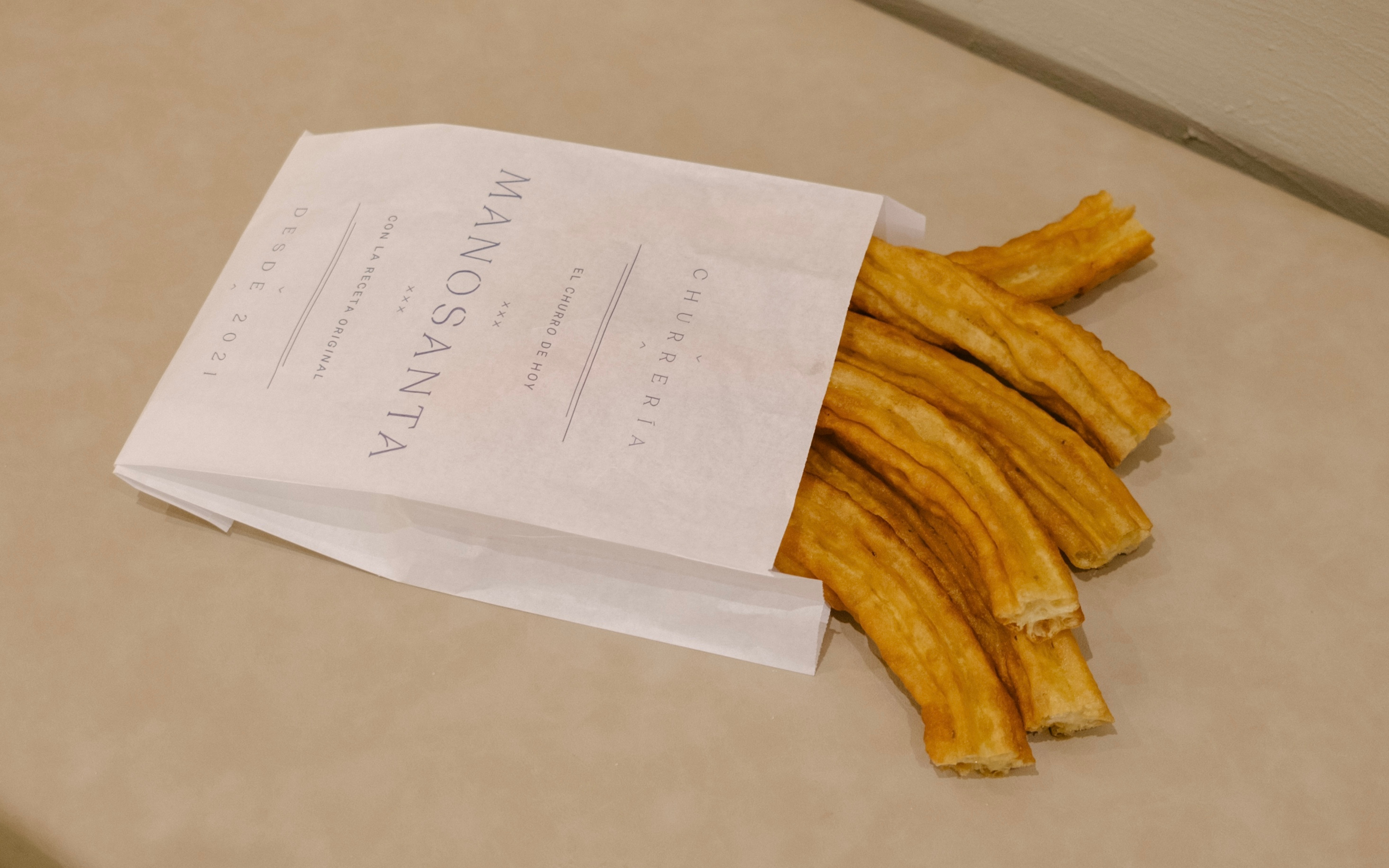
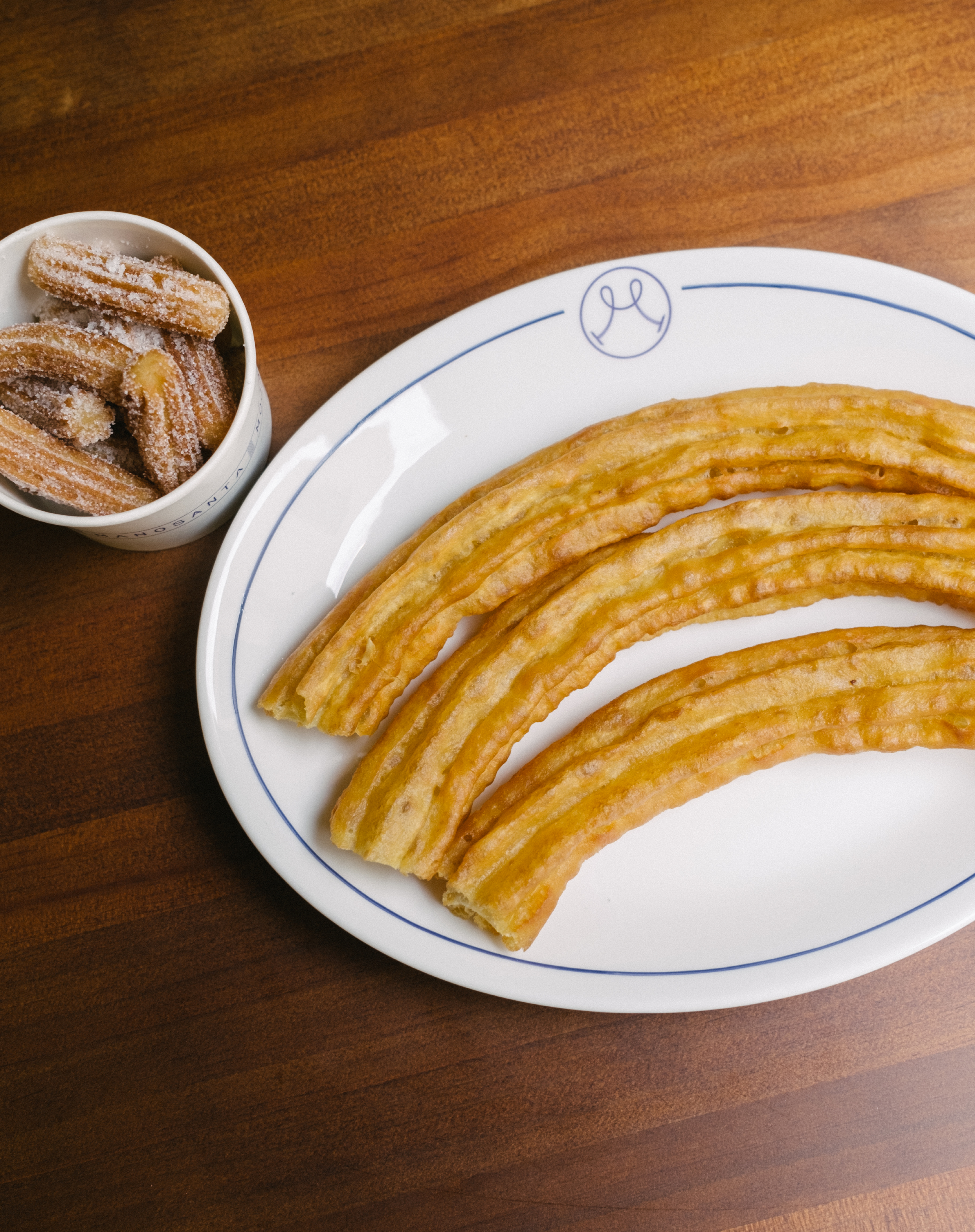
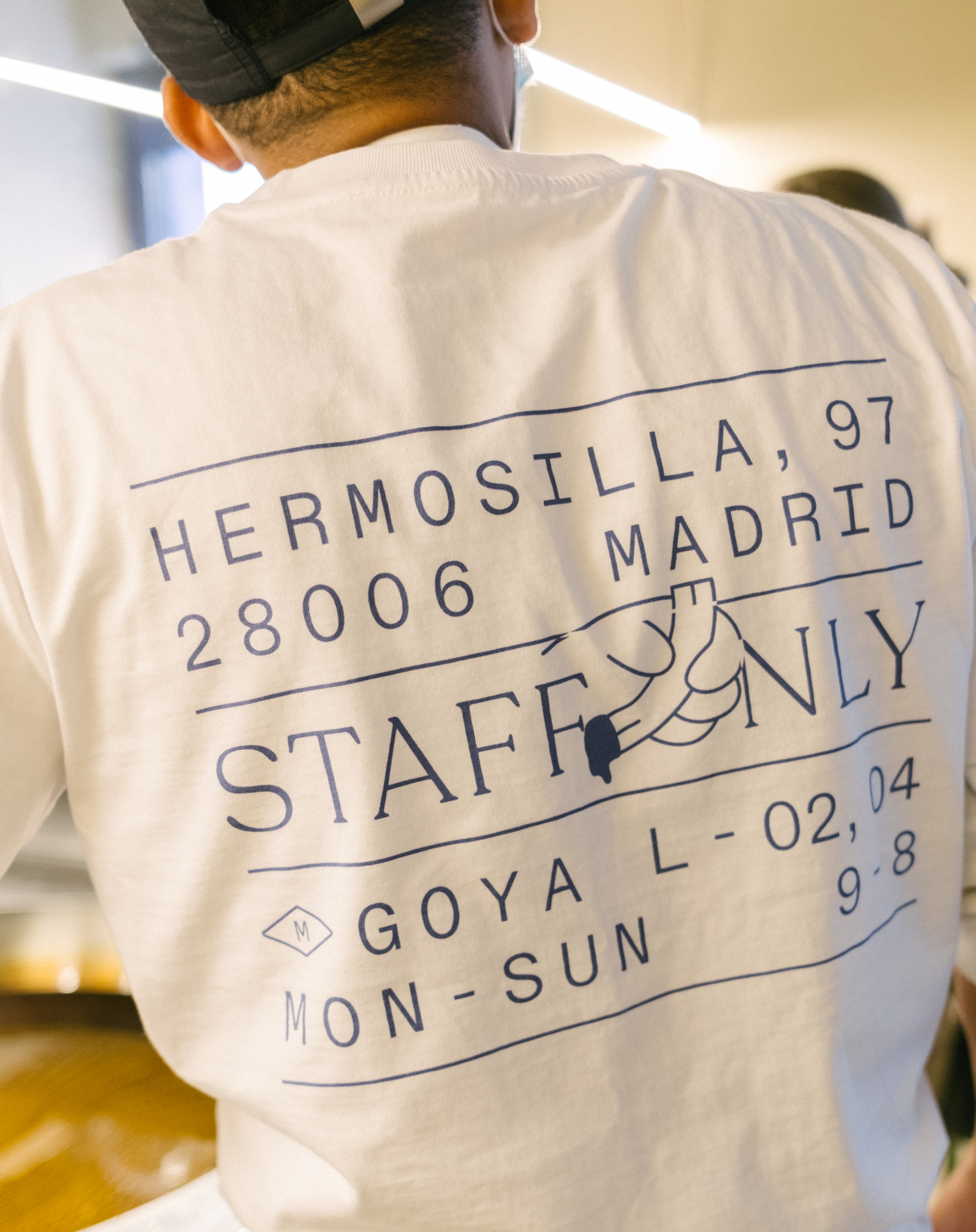
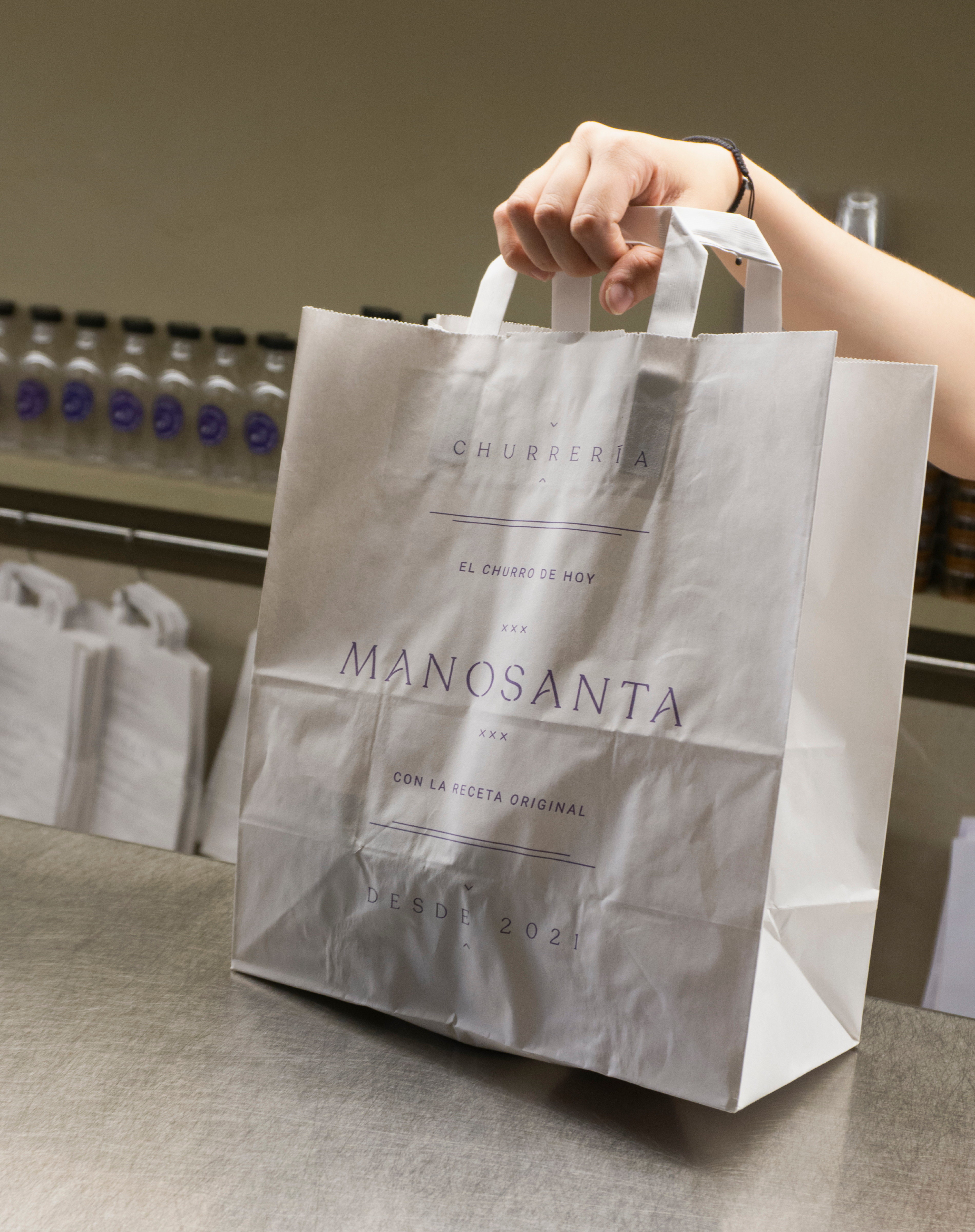
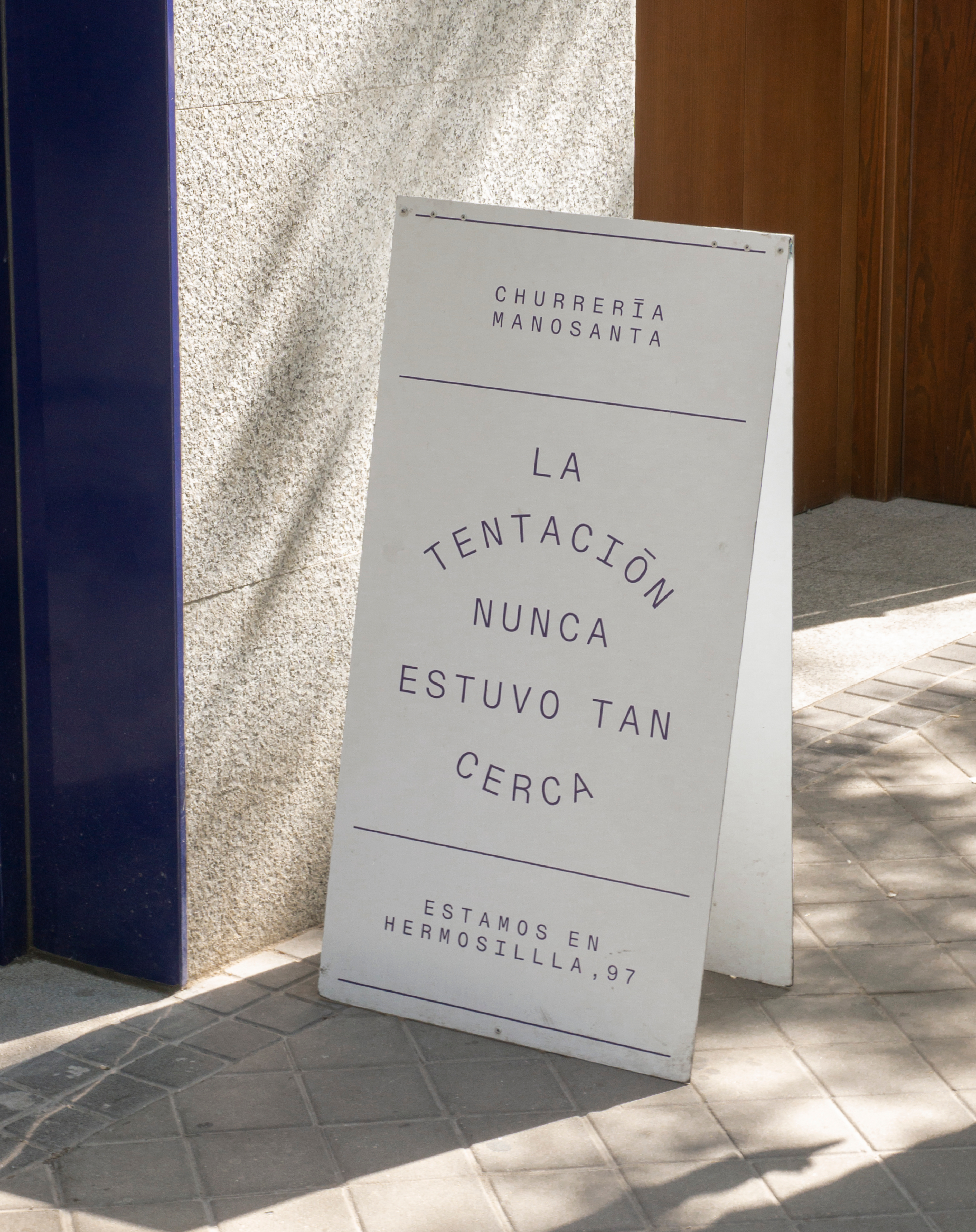
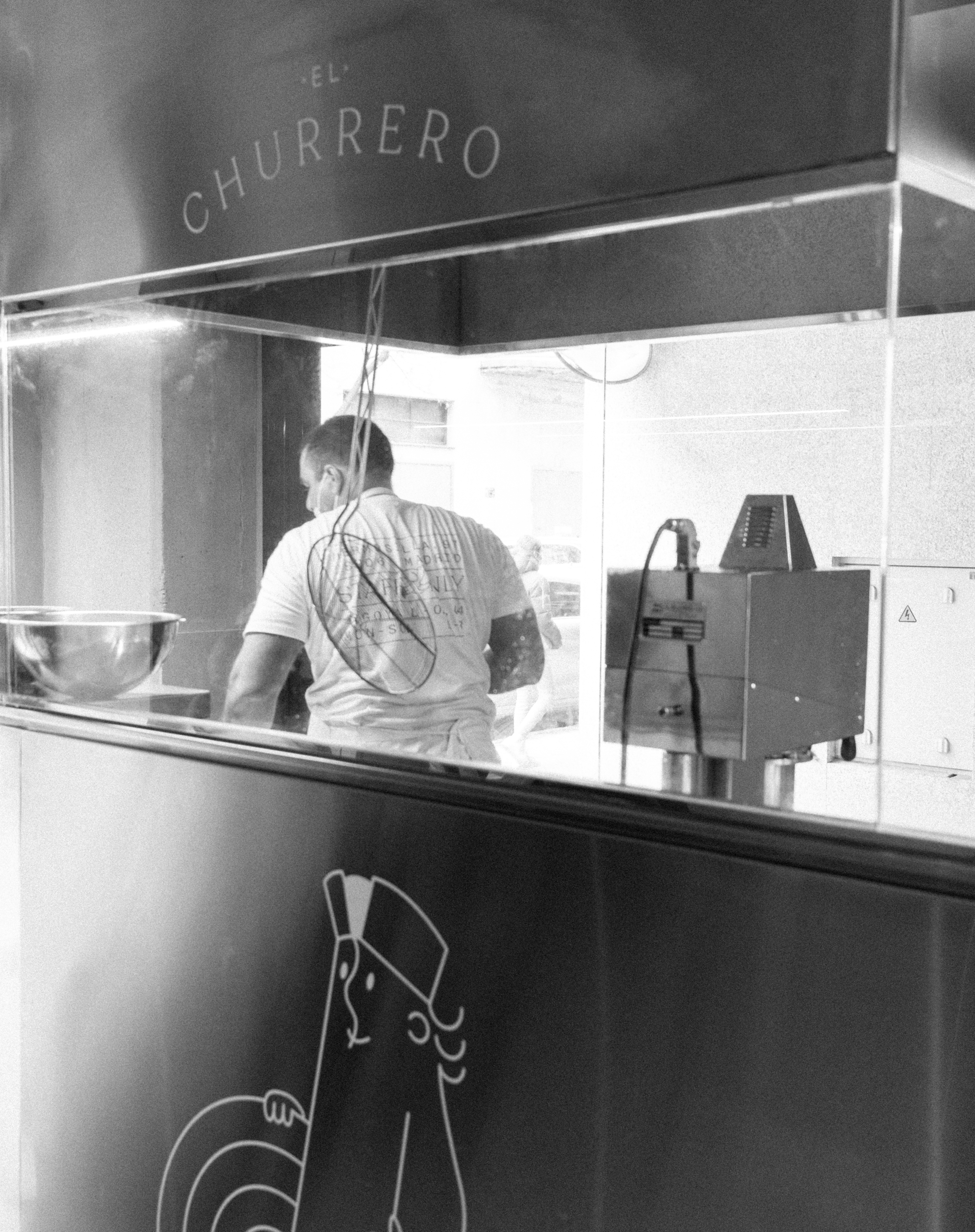
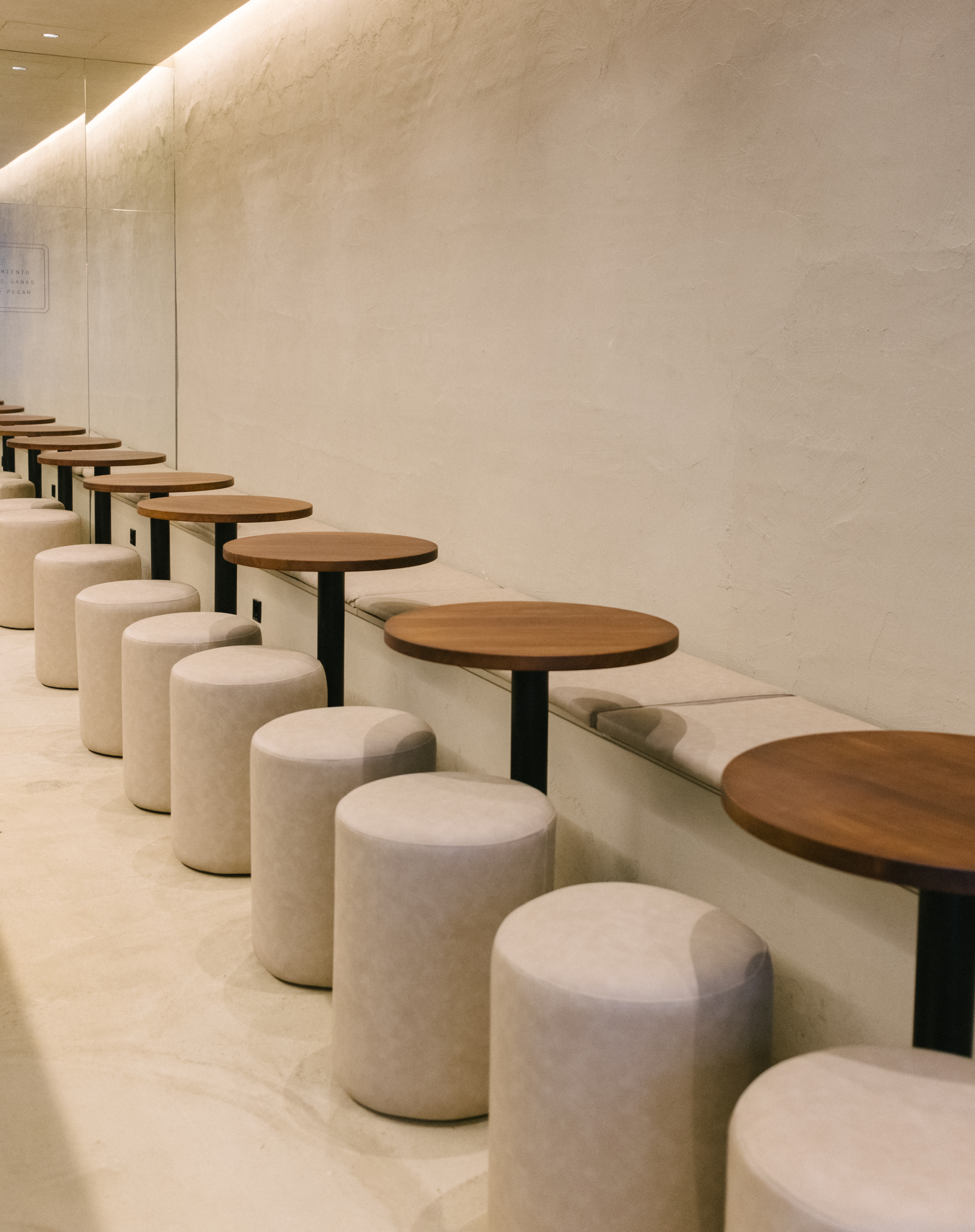
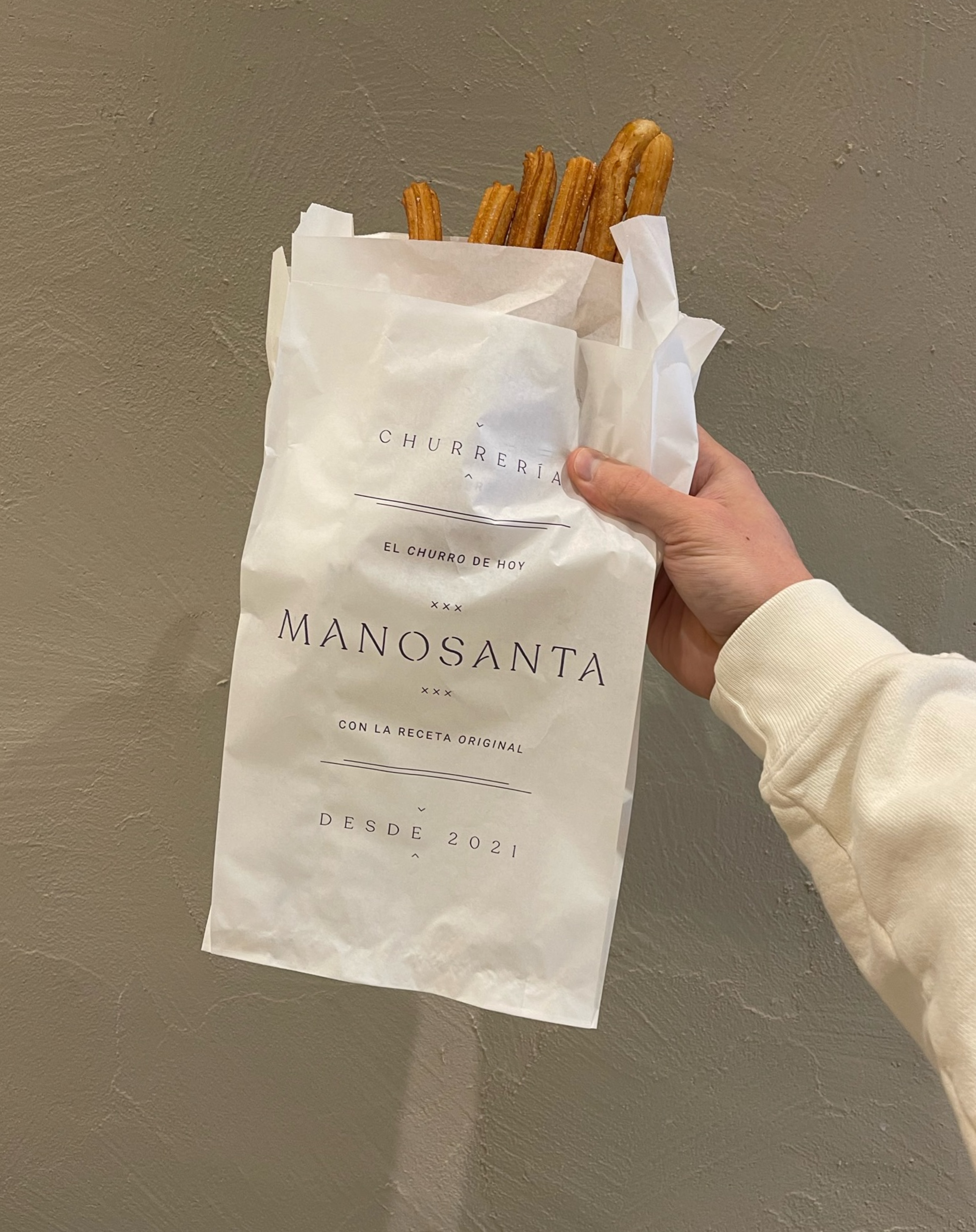
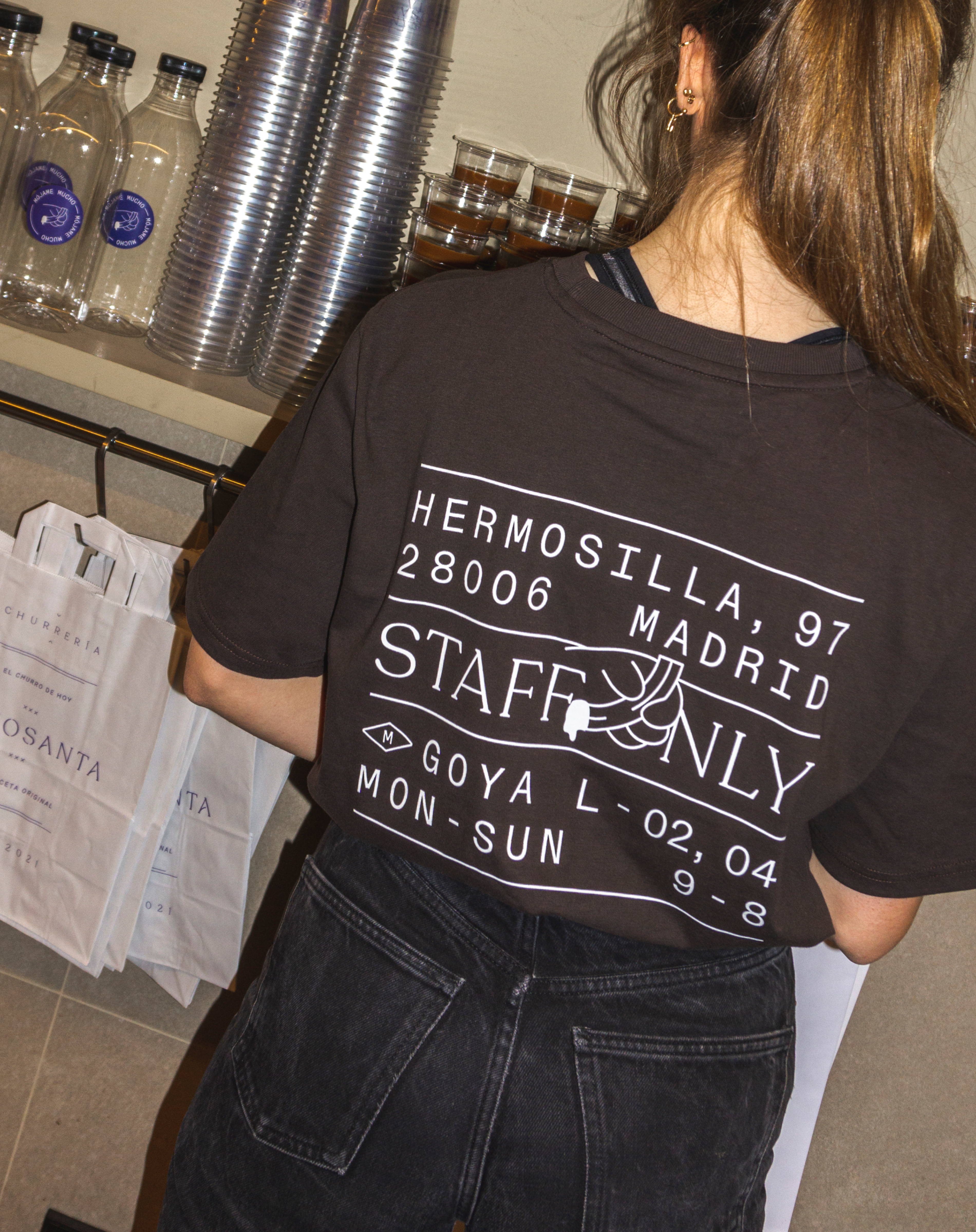
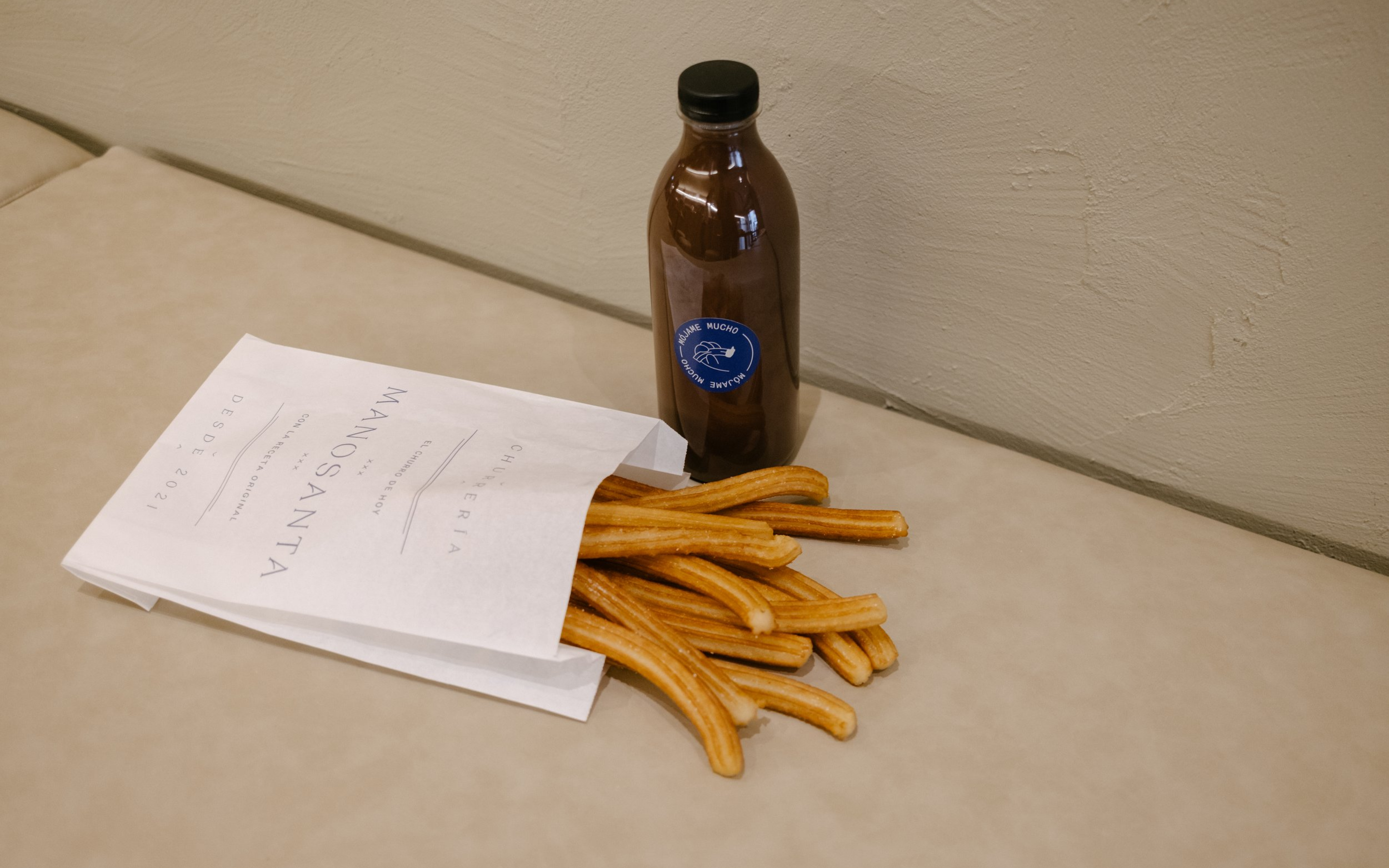
Manosanta is a new generation of churrería that combines traditional churro making with a contemporary attitude. The project involved creating a brand name, narrative, strategy, and visual identity, which was applied across various platforms such as packaging, space, and social media.
Featured in ELLE and AD
Interior design by Ana Cue and Norai Studio
Special thanks to Nacho, Bea, Ampi and Alejandra.
Photos by Nacho, Bea and Santi.
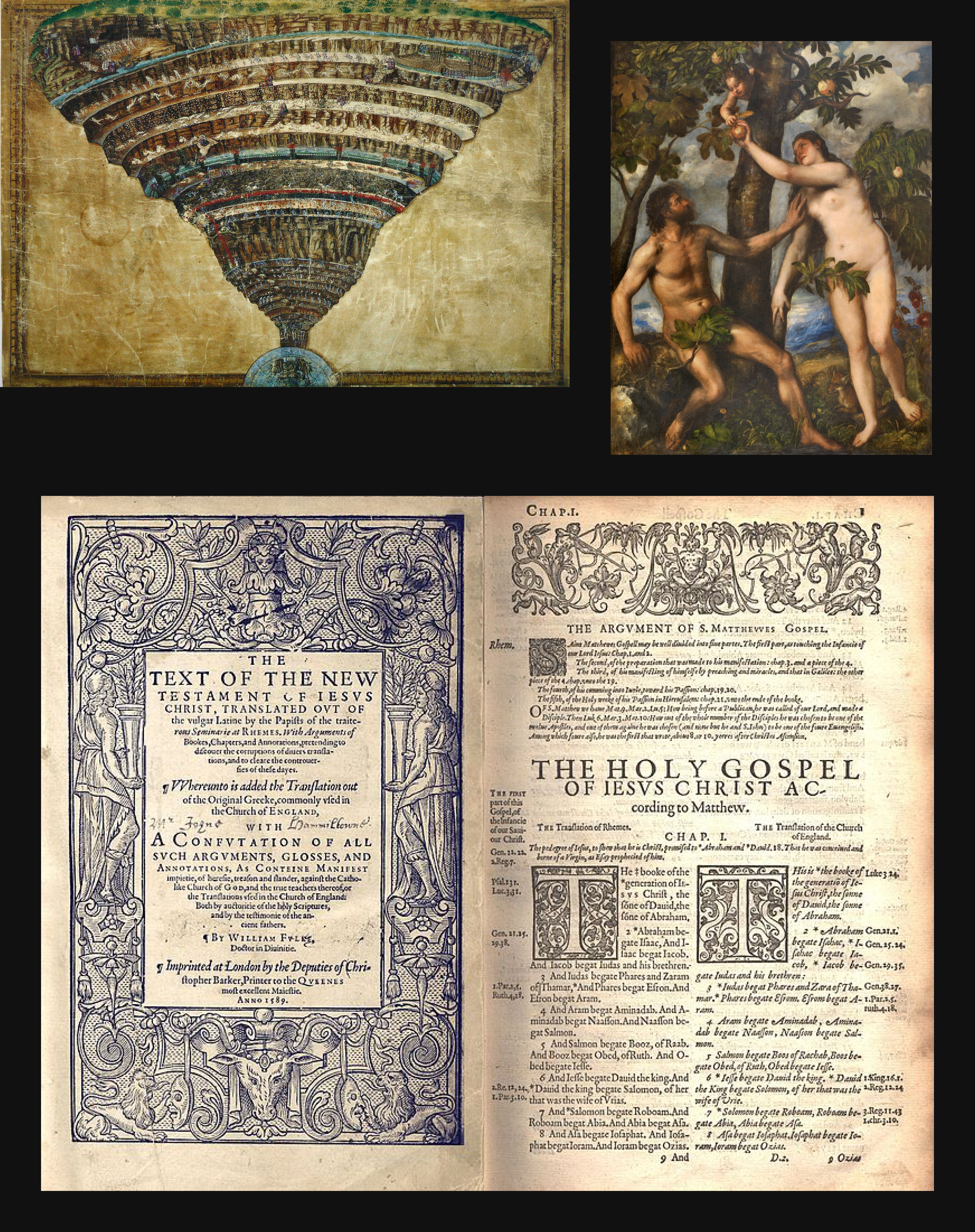
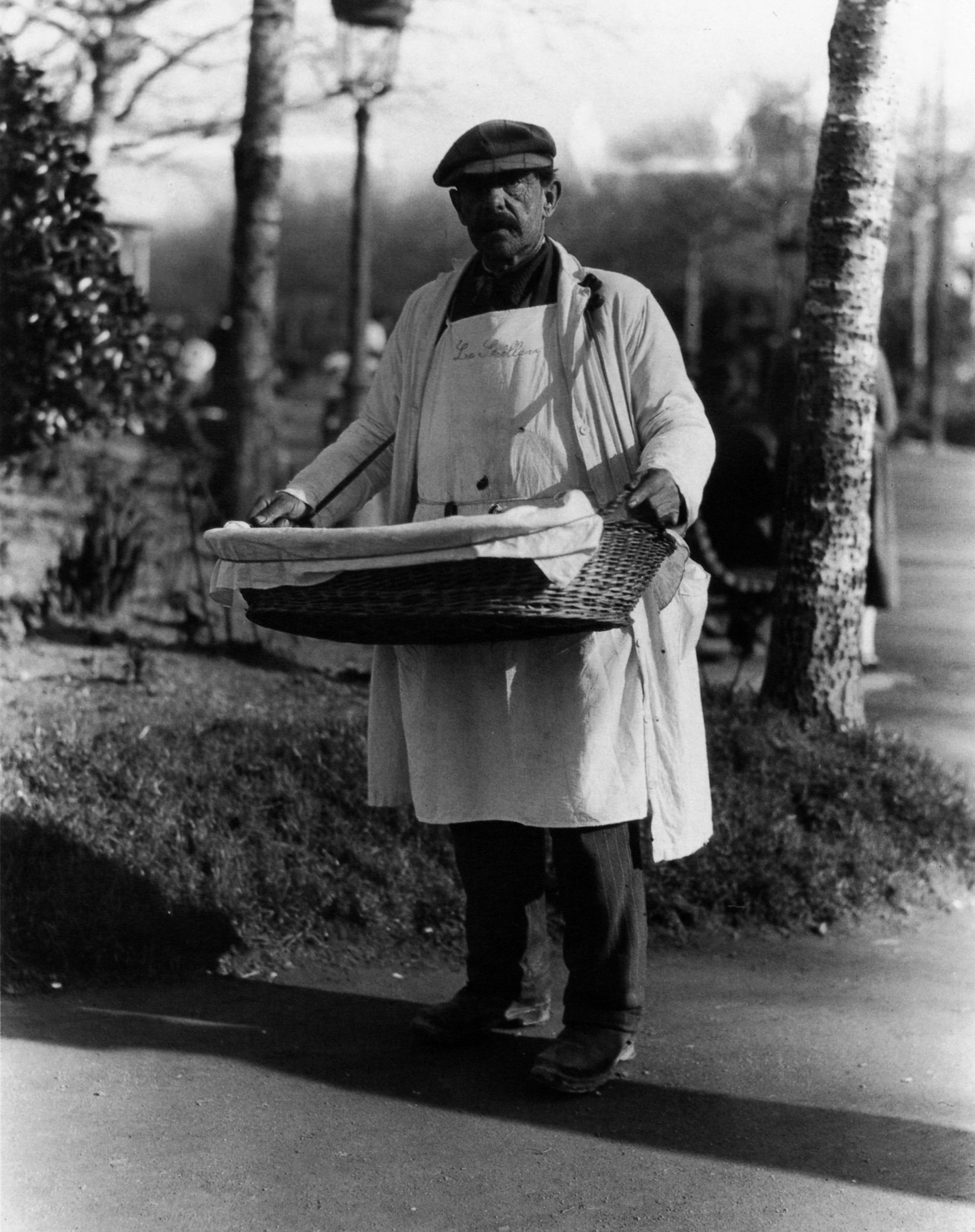
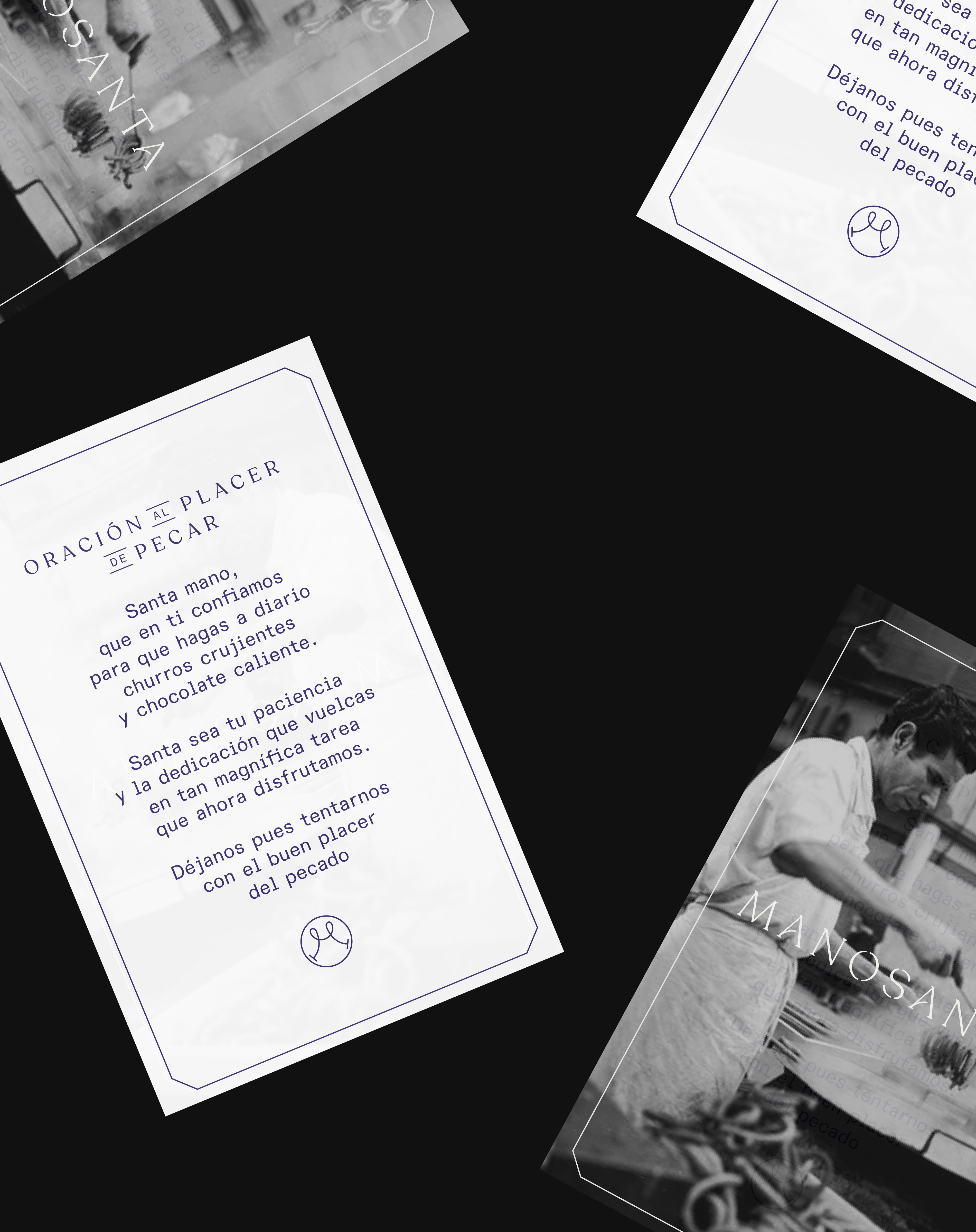
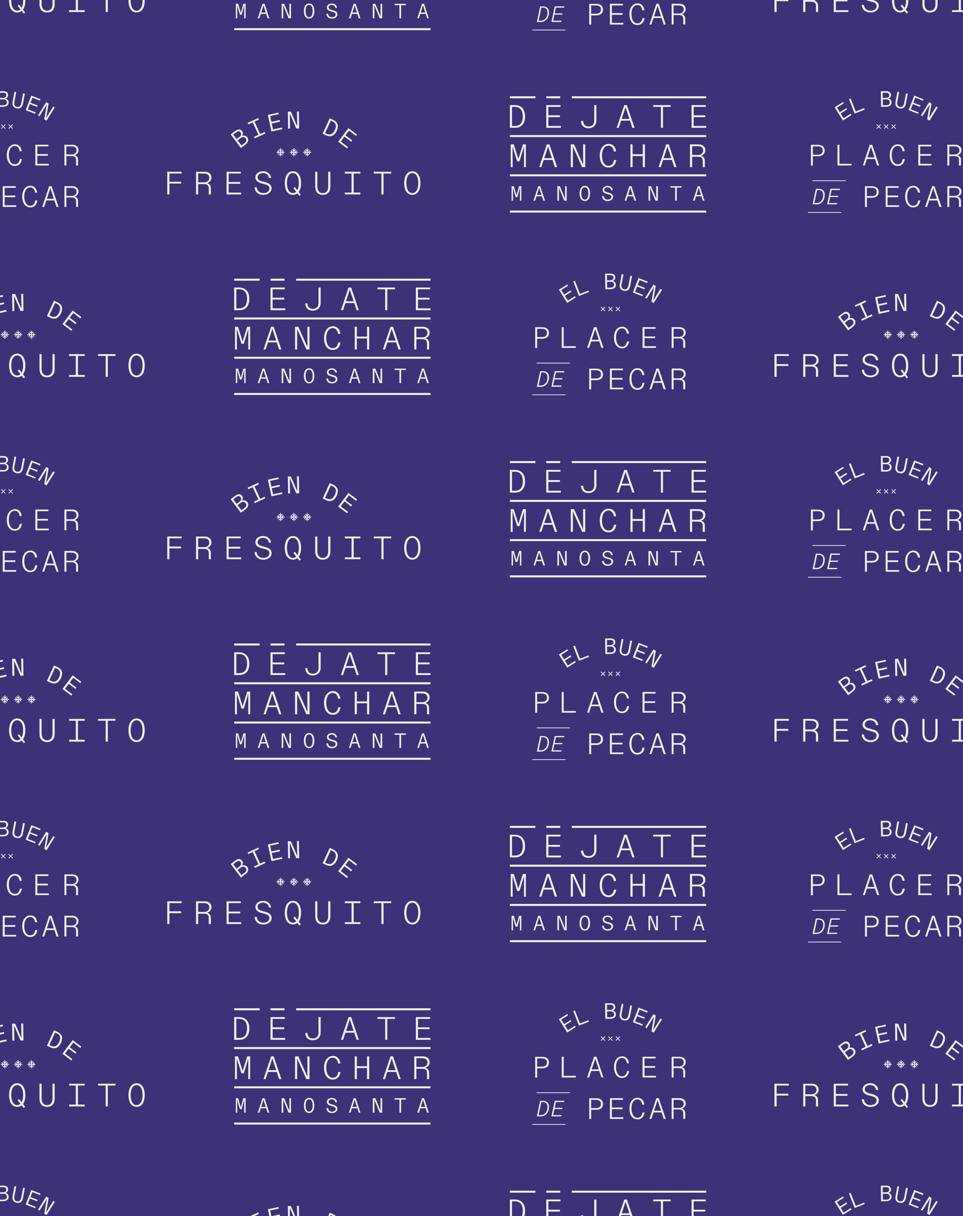
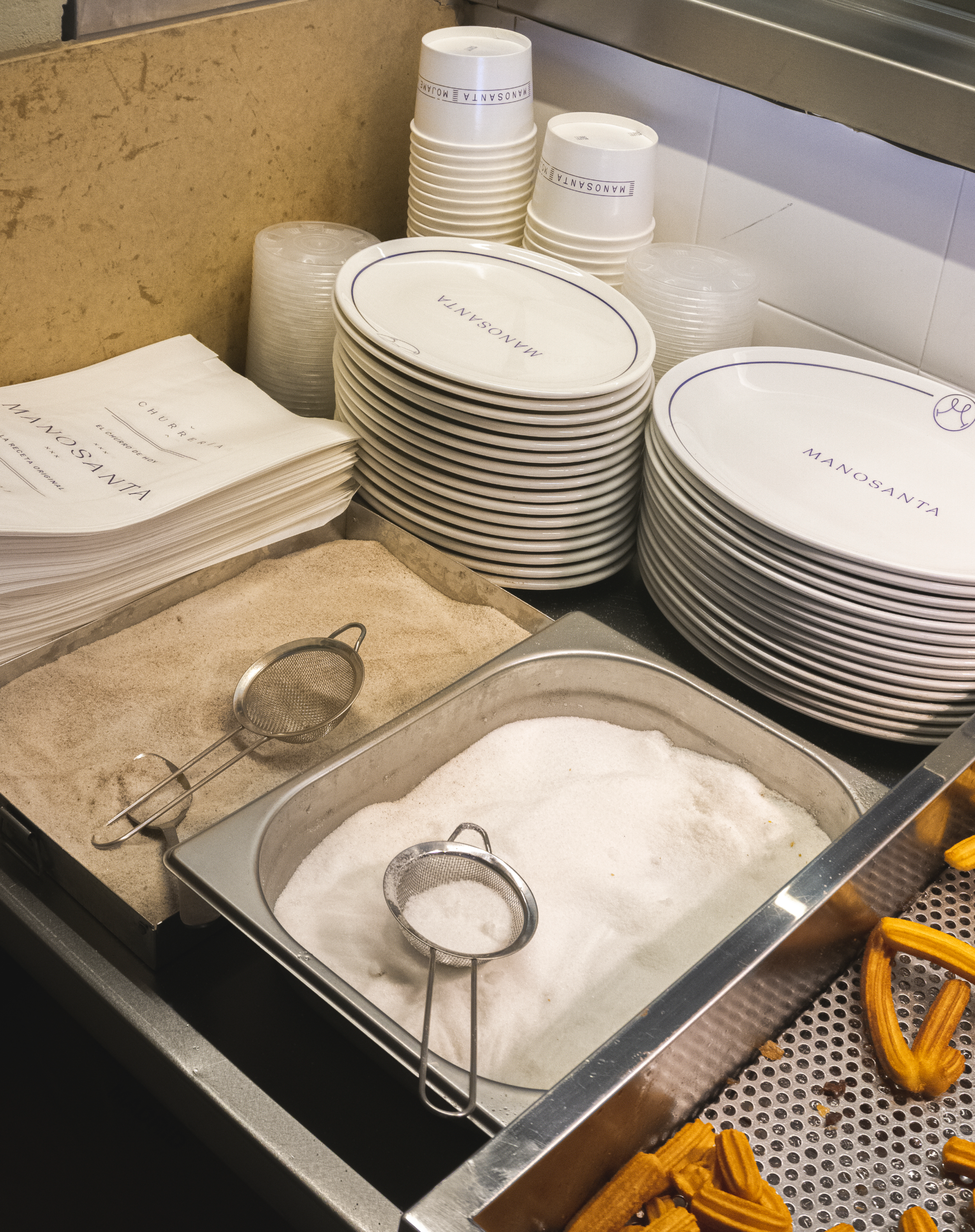
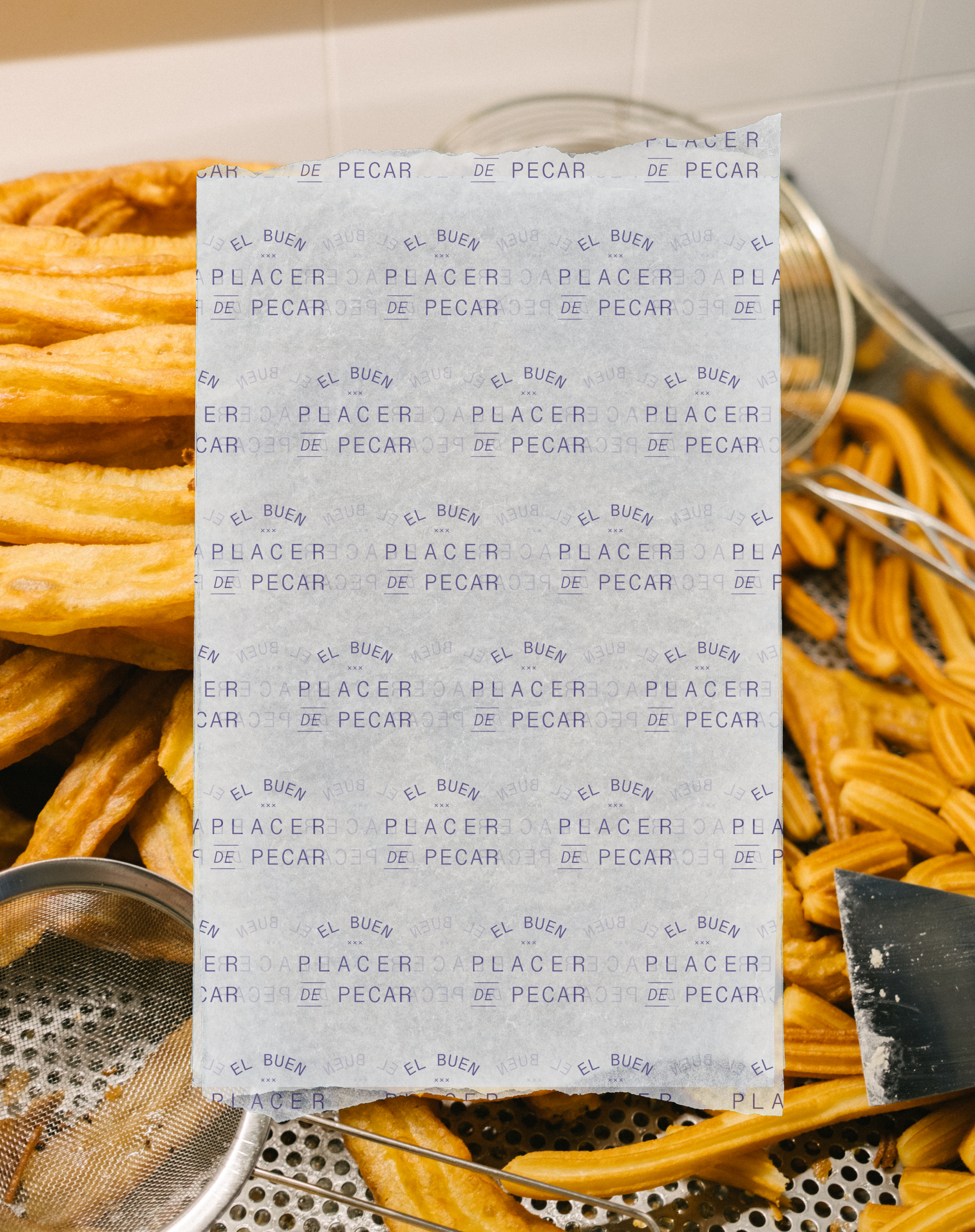
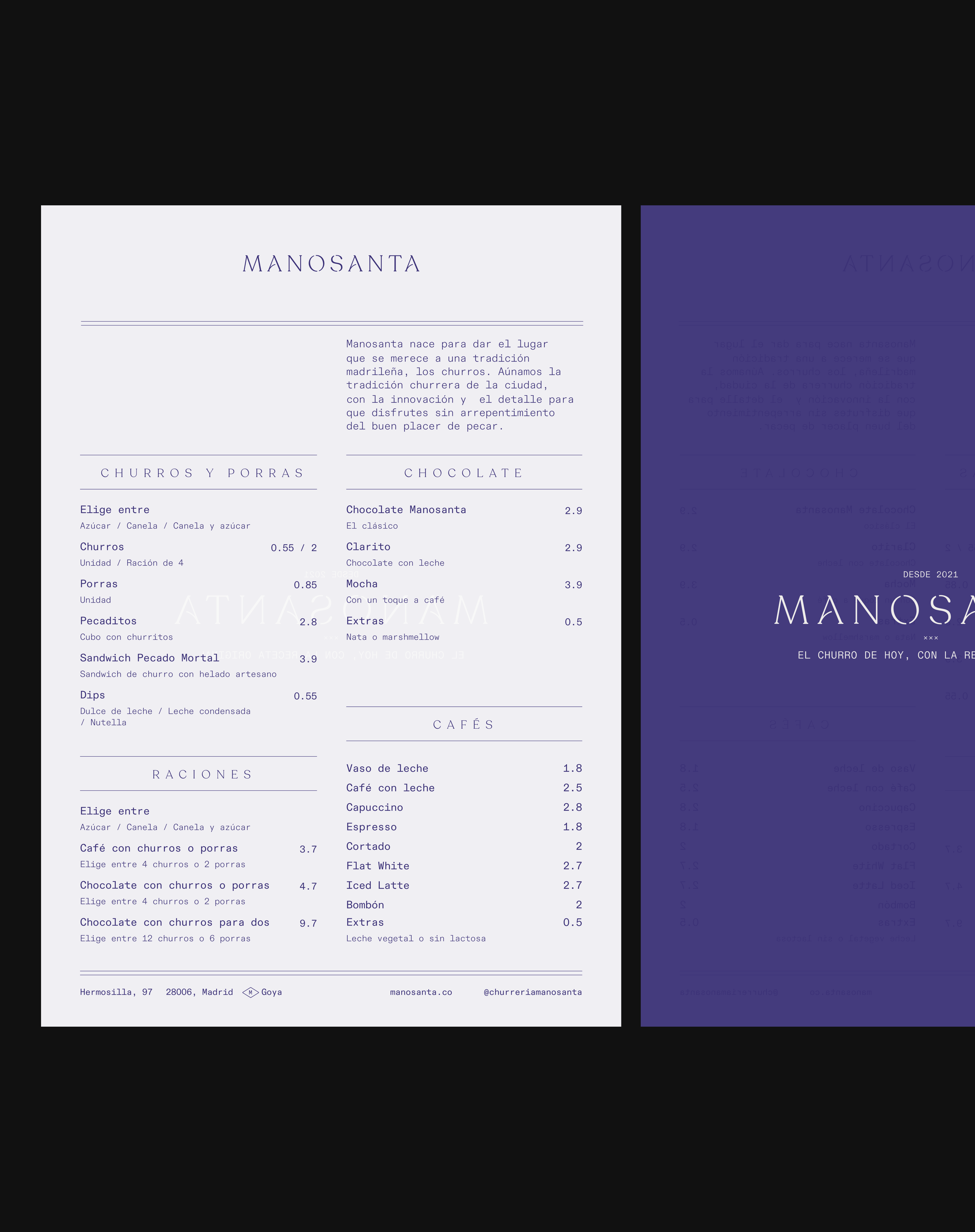
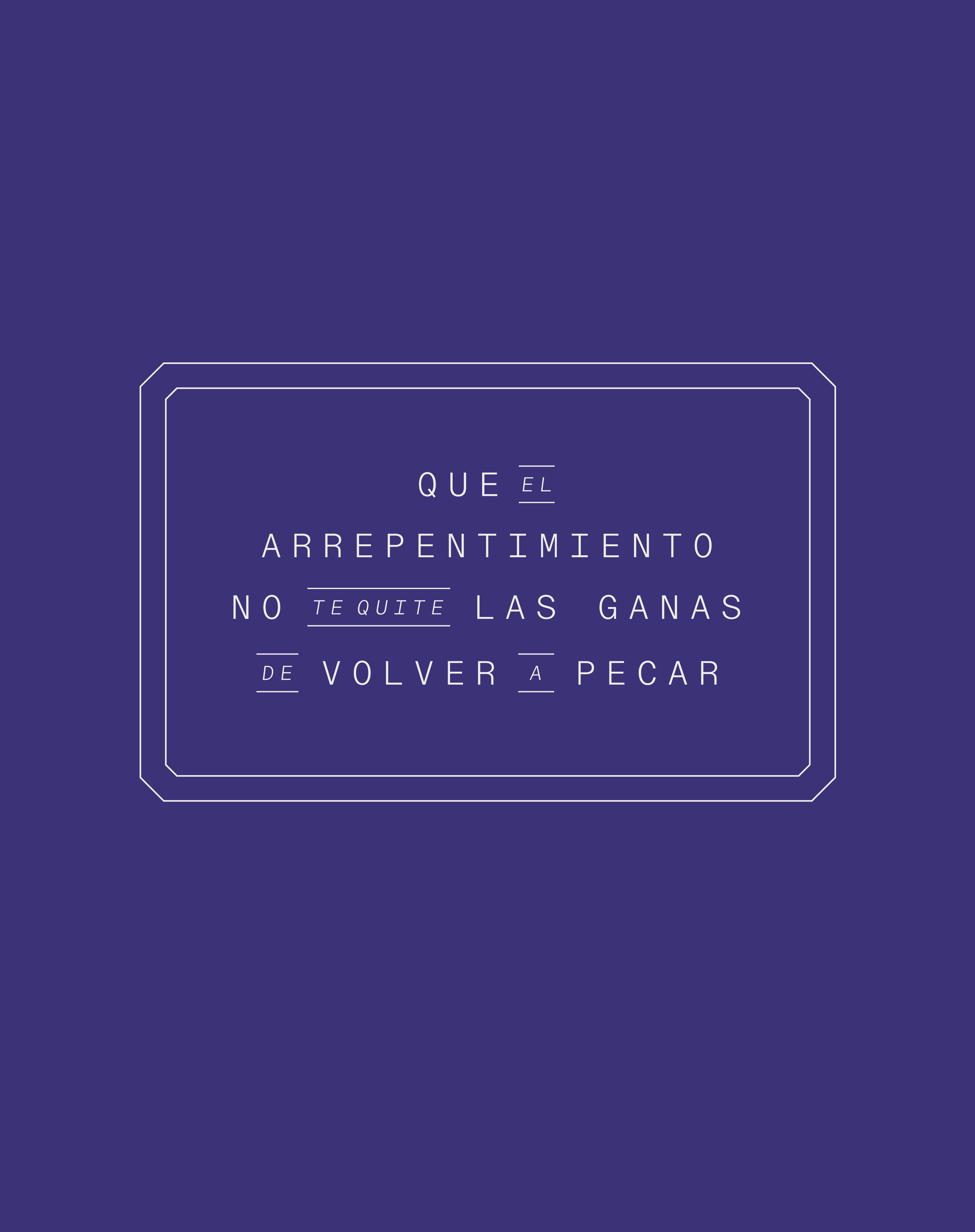
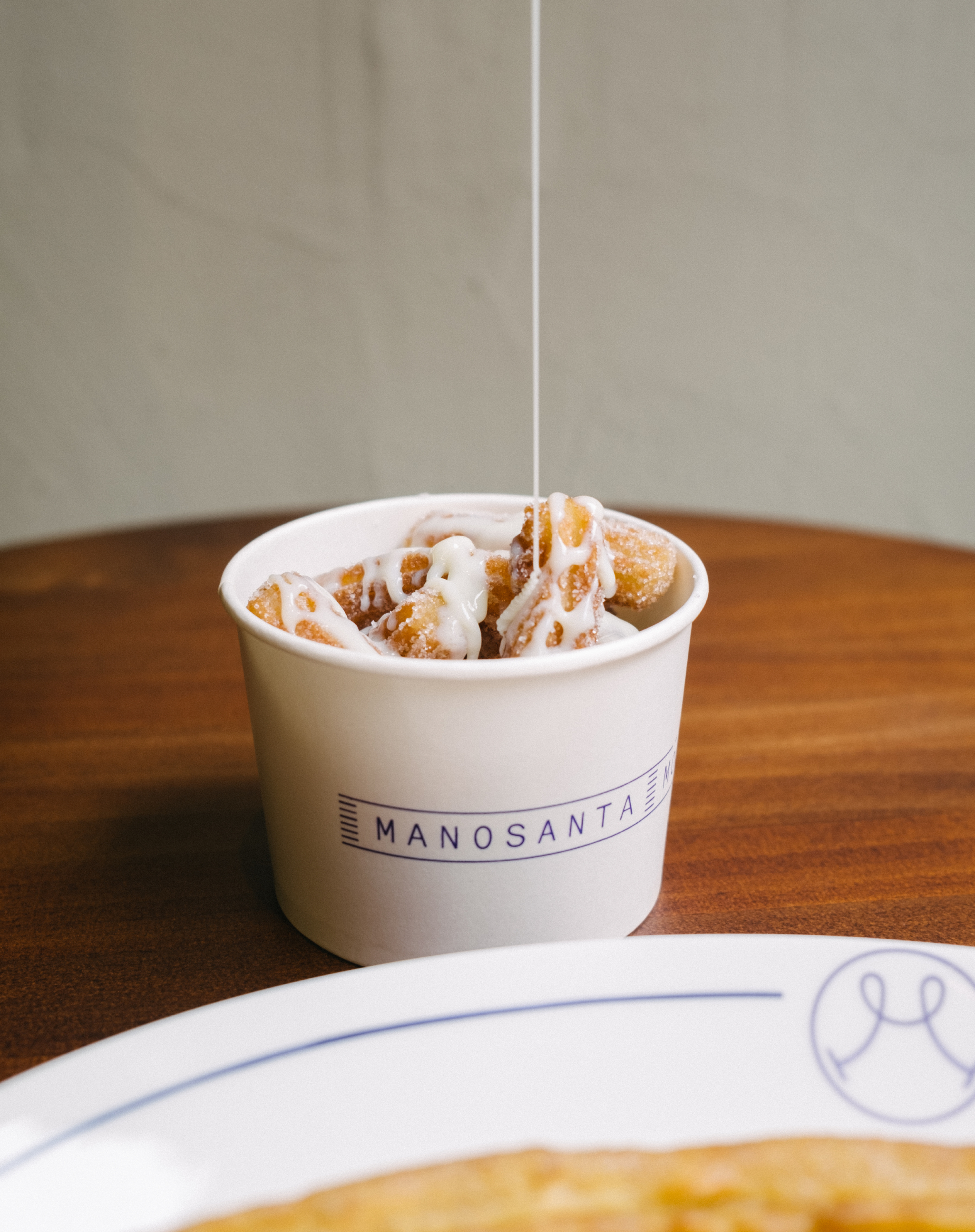
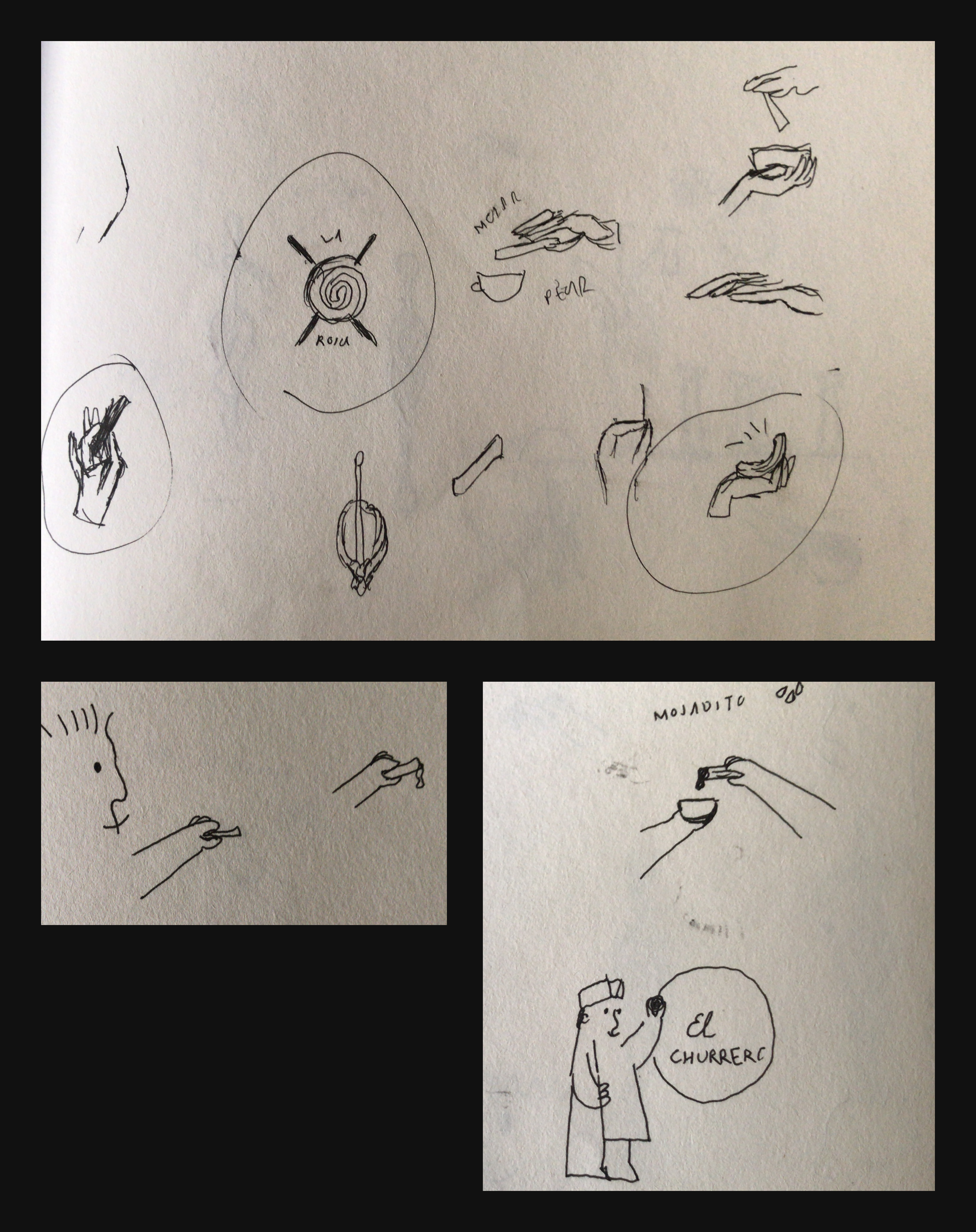
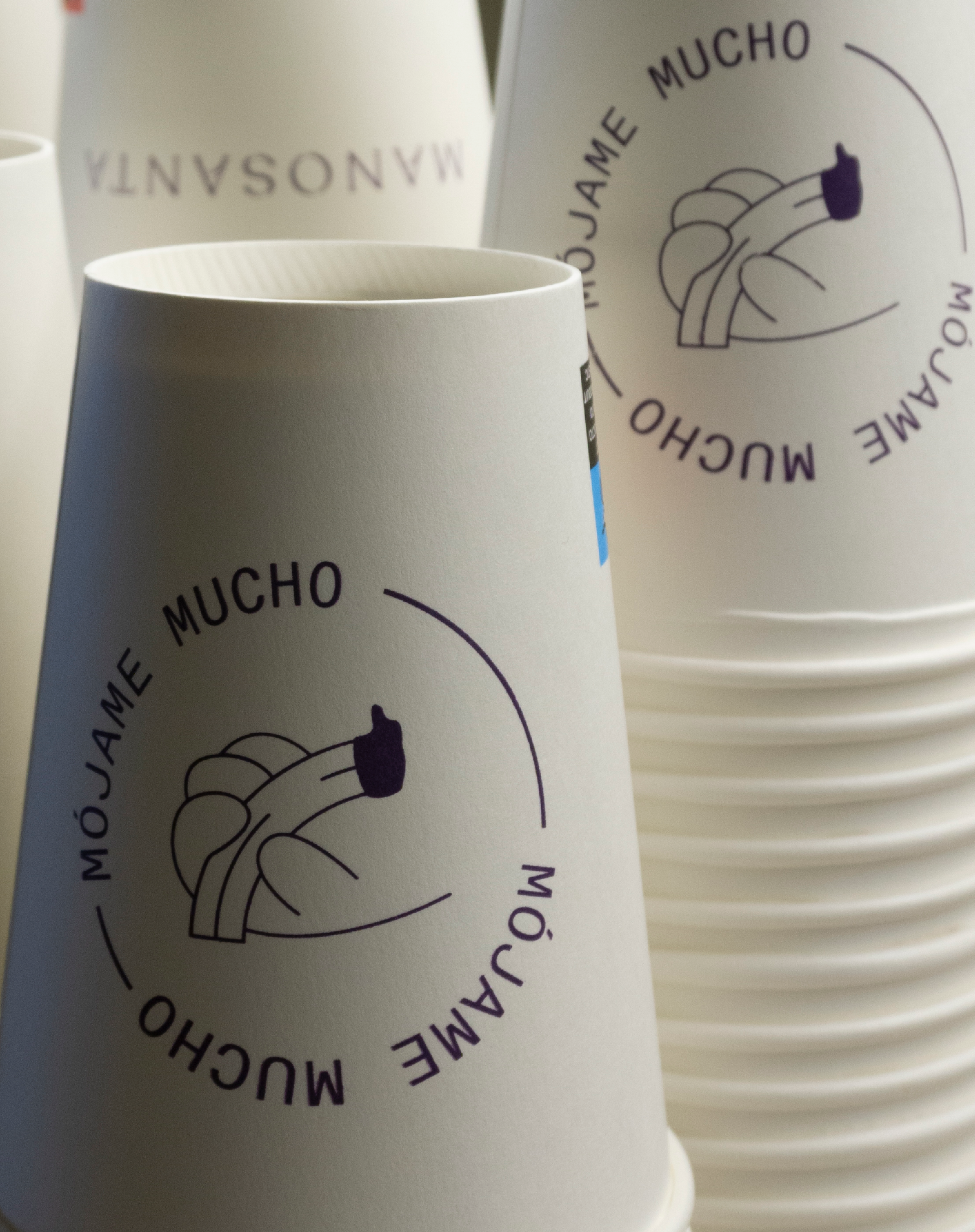
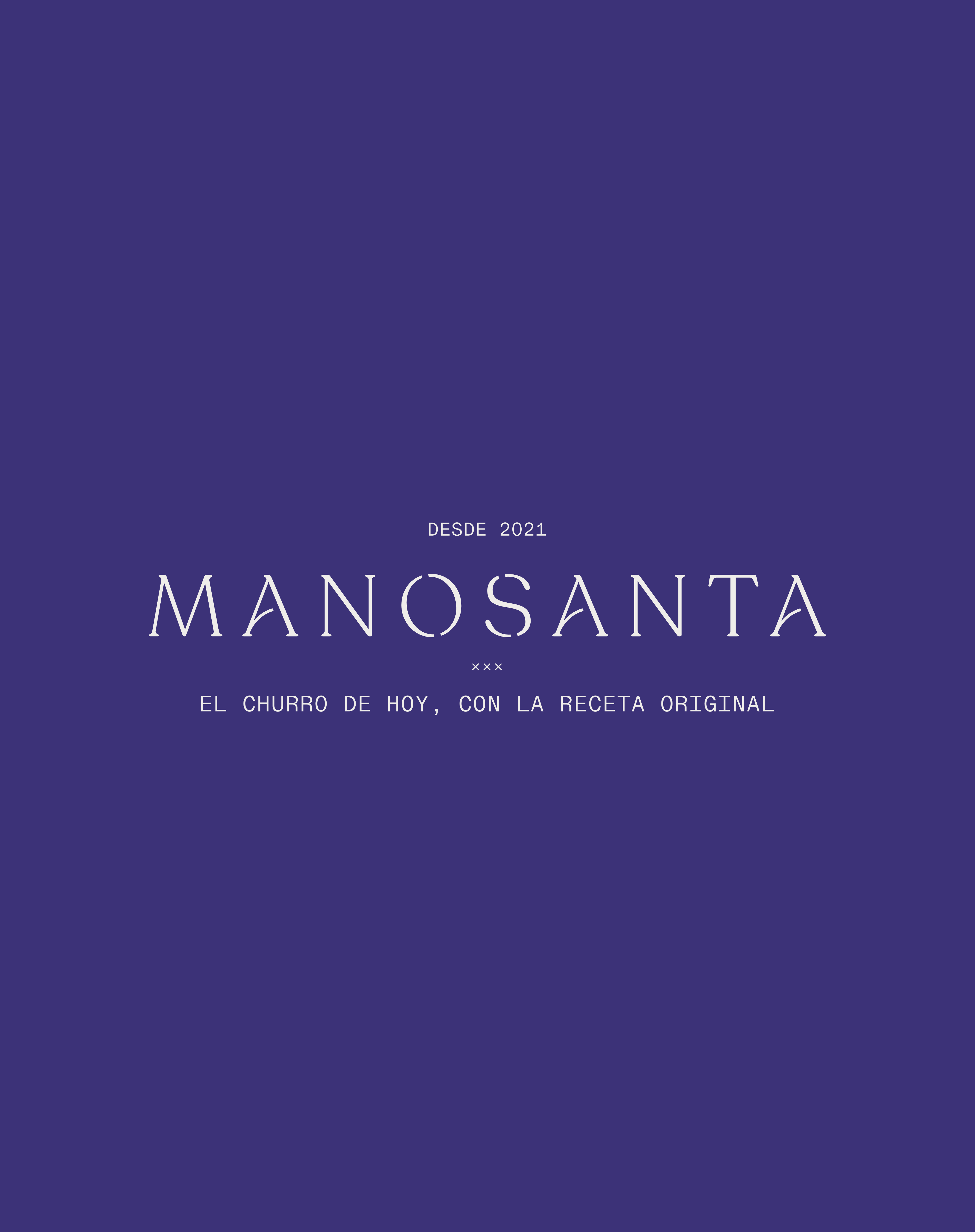
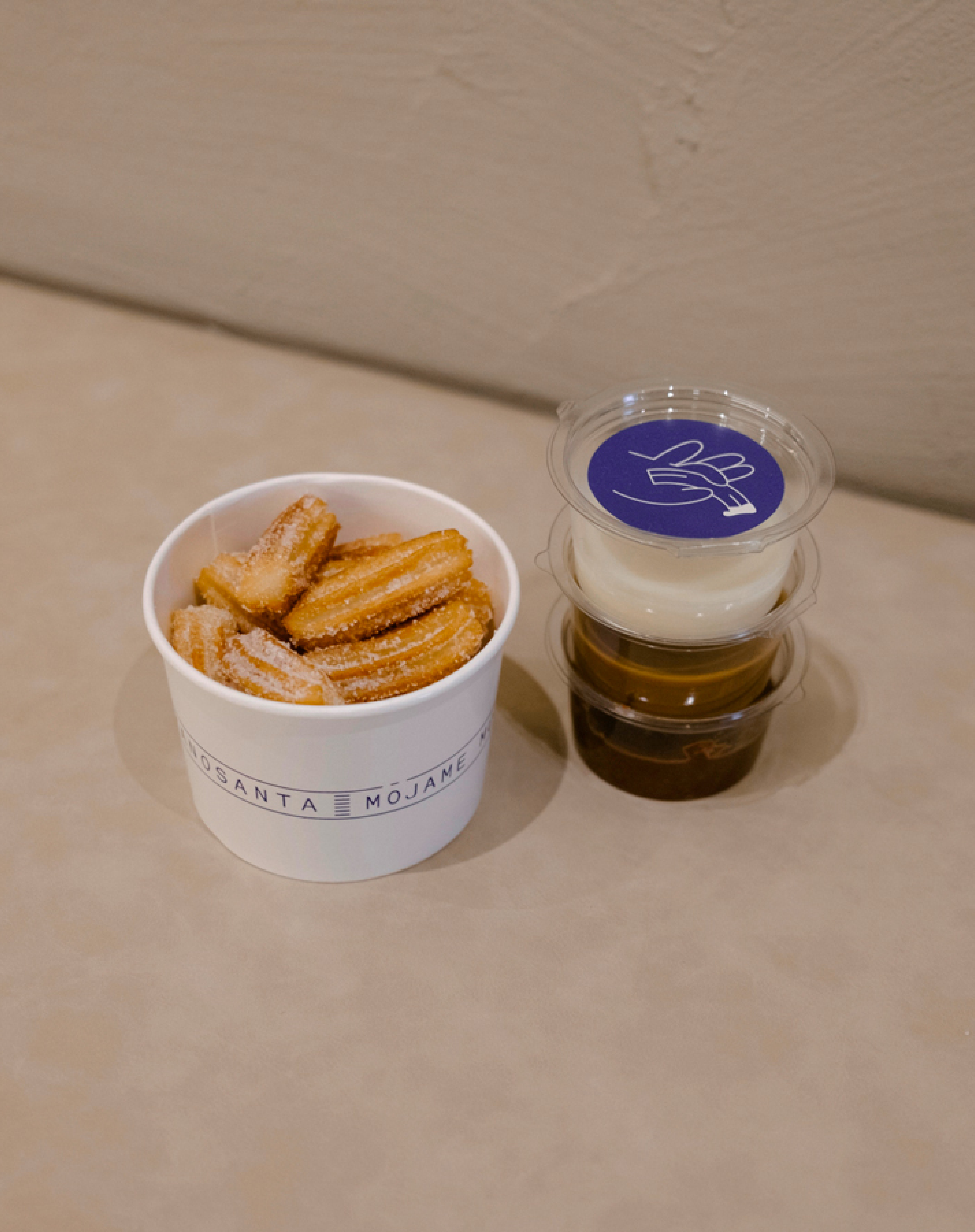
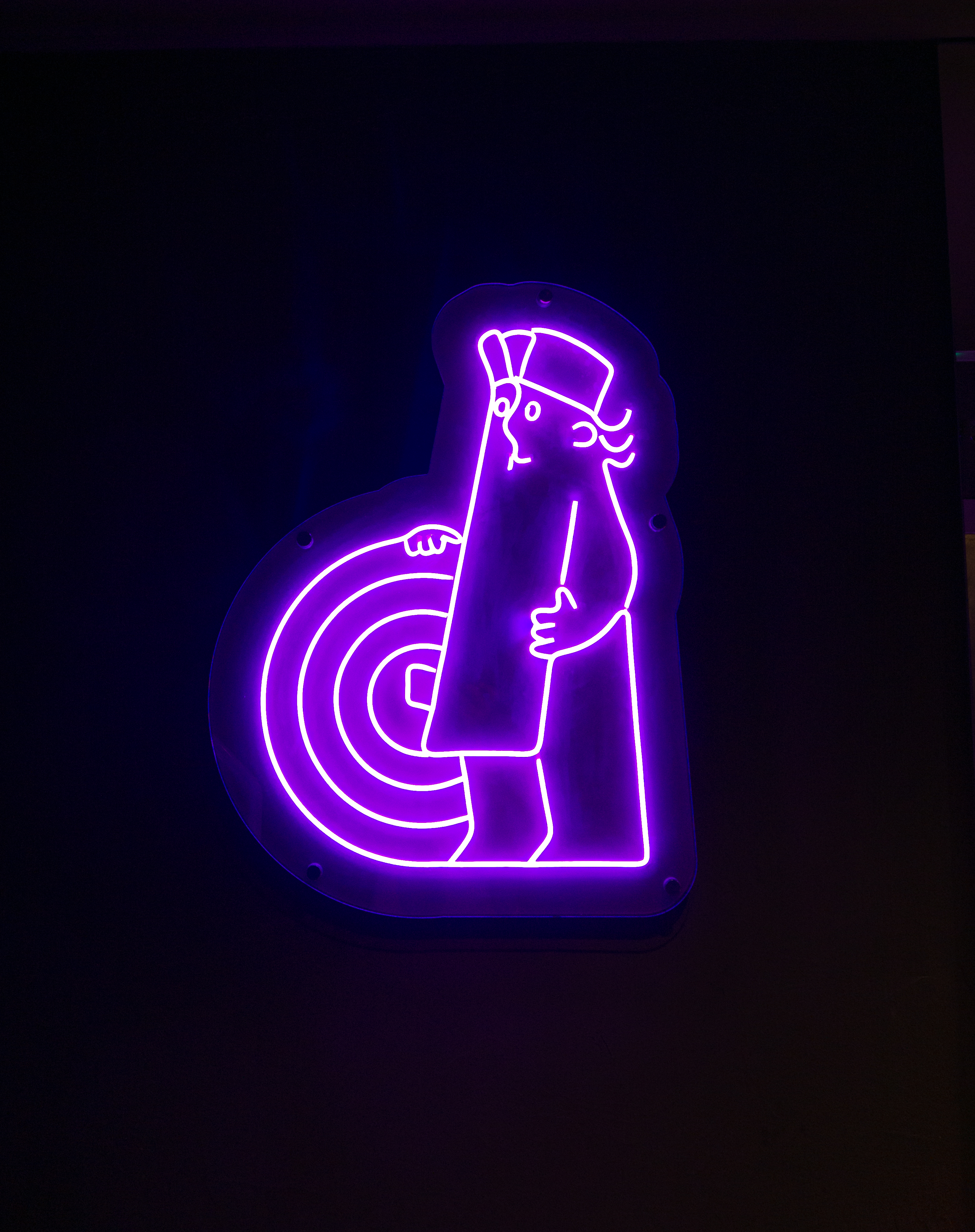
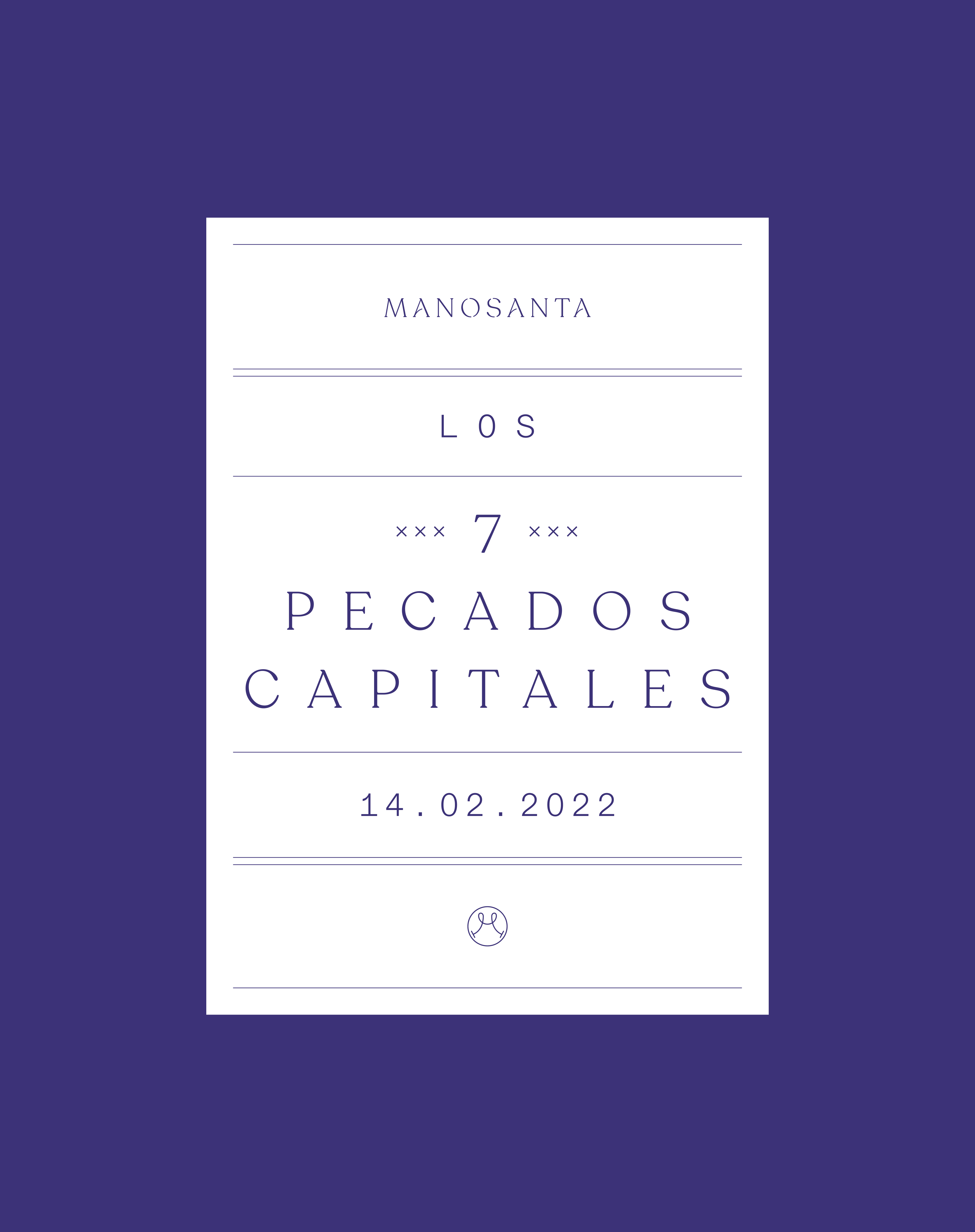
The brand's narrative is centered around the "pleasure of sin," inspired by the catholic tradition of consuming churros on Sundays. The name "Manosanta" (Holy hand) conveys both tradition and craft, as well as the brand's story.
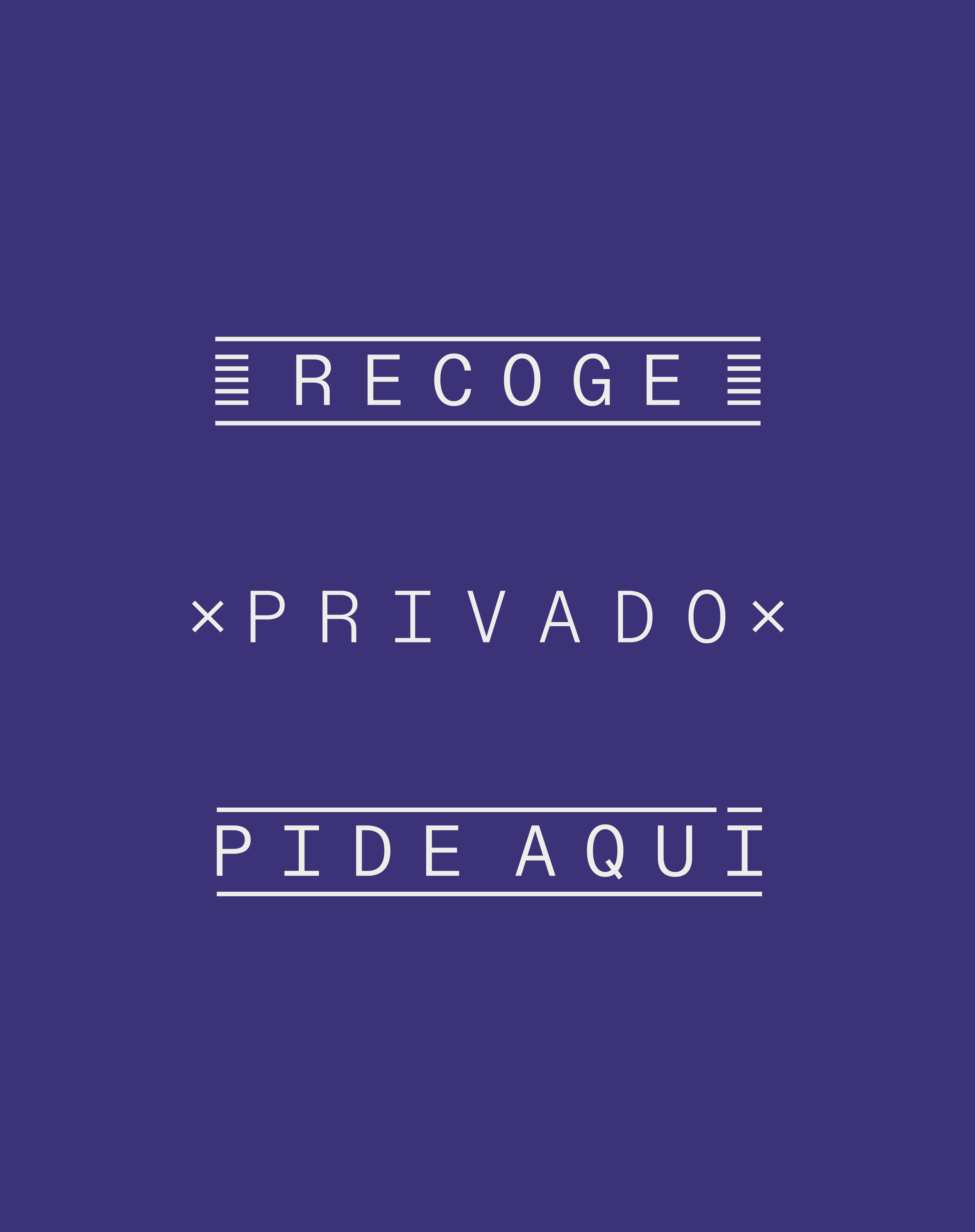
The verbal identity uses biblical language with irony and a playful appeal, while the visual identity is minimal and classic, featuring bespoke illustrations. The brand's color, purple, is inspired by the nazarenes' cloaks and hoods during the Spanish "Semana Santa" parades.


®2024